
The Beginning: Something is Broken!
Published:
So, my PhD topic is to implement transformer models for toxicity prediction and molecular generation. Or in plain english, given a molecule (e.g., a drug), I want to train an “AI” model to predict its possible toxic effect on the body and the environment. Even better, create new formulas for molecules that will be safe biologically and environmentally. However, in this post, I will show you how I had to make a major detour before I even attempt to do so!
To be able to tackle the endeavour of transformers for molecular property prediction (MPP), I began by venturing into the wilderness—reading the papers that trained transformer models for MPP. While reading, I asked myself four key questions:
- What is there?
- What is good?
- What is missing?
- What is promising?
I already had some experience with transformer models from the field of Natural Language Processing (NLP), so I was aware of the nuances in the architecture.
As I started exploring the literature, I found that sooo many things had been tried independently, with each paper introducing its own tweaks. My first thought was:
Let’s put into tables what these papers did, so that we know what was done similarly and what was done differently.
And that seed eventually bloomed into our review paper on Transformers for molecular property prediction1!
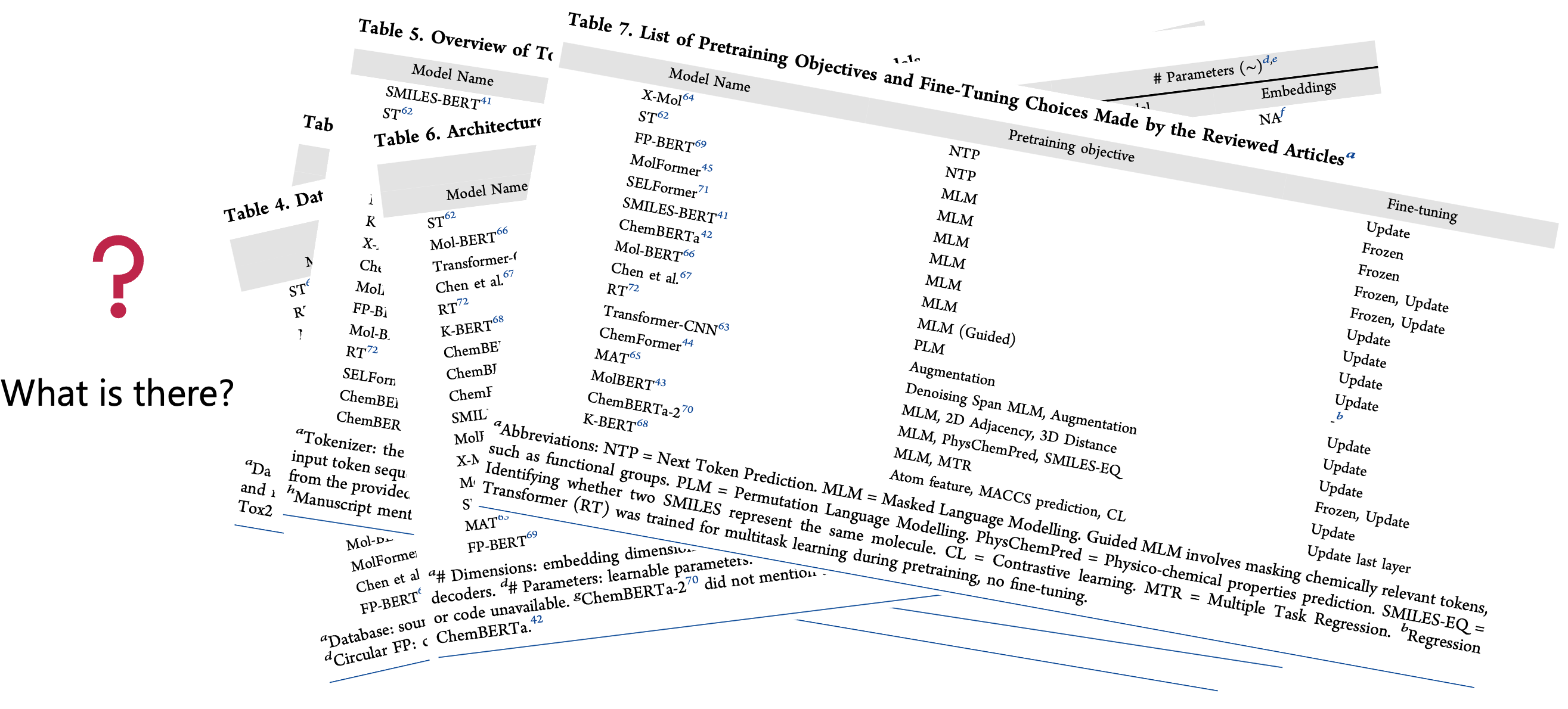
So, with the tables in Figure 1, we answered the first question: What is there?
Now, we move to the second question: What is good?
Answering this question required a two-fold approach:
- True hypothesis: If a modification to a method is proposed, prove that it improves over the unmodified method (aka, ablation analysis).
- Superior benchmarking: If a new method is proposed, prove that it competes against simpler, pre-existing methods.
Armed with this framework, we started checking whether the proposed models satisfied both criteria.
Starting with the “true hypothesis” criterion, we found that almost all papers reported their model’s performance in the same way, a table (Figure 2).

Let’s acknowledge something here: this table view is one of the most horrific ways to report model’s performance. Not just because Pat Walters keeps ranting about it, but because psychology strongly supports the criticism:
Humans are TERRIBLE with numbers! [1–3]
Our brains are not wired to hold onto numeric information—especially decimals. Add a ± standard deviation or error margin, and you’ve got a recipe for confusion.
What our brains do handle well is spatial information. Half of our cerebral cortex is dedicated to it [4]. Experiments have shown that visuals (e.g., bar plots) aid decision-making far better than numeric tables [5, 6].
I’d be more than happy to discuss the best visualization methods in a discussion or a later post, but for now, I would like to make one thing clear:
ANYTHING beyond table reporting is a step in the right direction.
So, because I knew I couldn’t trust myself (or others) to glean insights from raw numbers, I decided to manually2 😣 extract performance numbers, put them in Excel, and start plotting them myself (Figure 3).
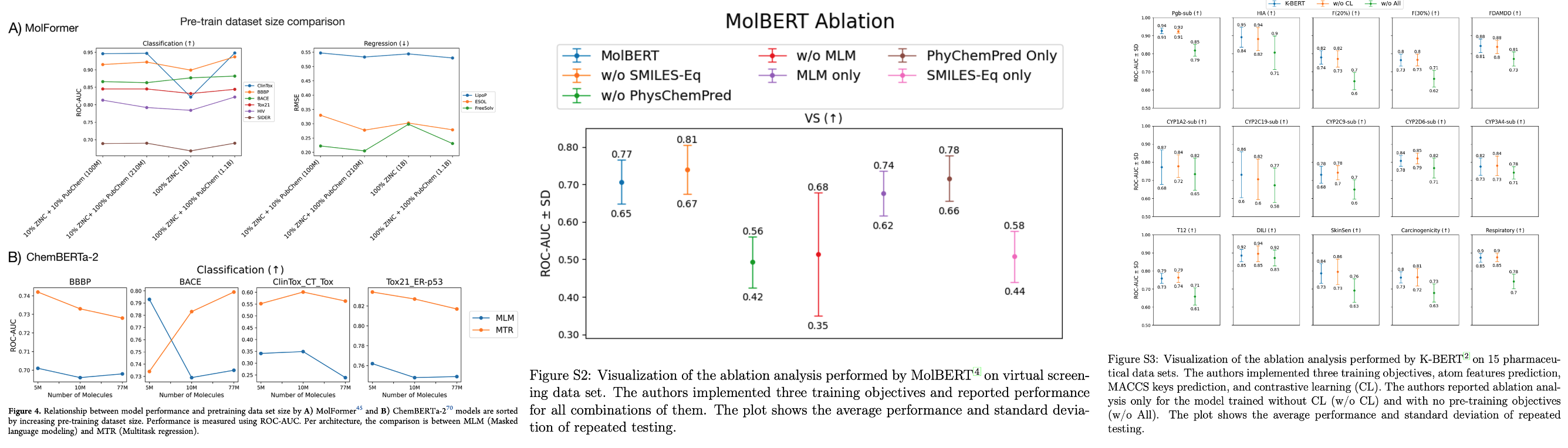
Four of the reviewed articles provided ablation analyses. We used two types of plots based on how each paper reported their table of numbers —point plots (probably averages) and plots with error bars (standard deviations).
Now we could actually see performance differences. But interpreting these plots is not really trivial.
The conclusion (in a massive oversimplification)?
Almost no new modification showed clearly superior performance over the unmodified method; further analysis is needed to claim superiority.
Yes, it’s a very bold statement to make —especially when most articles claimed their method was a great idea.
For a full walkthrough on how one can reach the same conclusion, please wait for my next blog posts, which will explain this in painful details. 😉
Now onto the second fold: Superior benchmarking.
Any new model should be accompanied by an answer to the question: Why should I use it?
And the least sophisticated answer would be: because it’s much better than current methods. This is especially crucial for models as computationally heavy and intricate as transformers.
So, we looked at how these papers benchmarked their models (Figure 4):
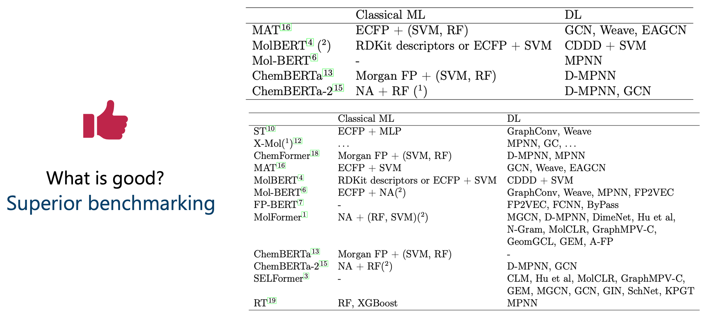
Some articles didn’t even compare against classic models like random forests (RF)—which are known strong baselines in our field.
Worse still, most articles presented their benchmarking in performance tables, again making proper judgment hard.
But the most catastrophic issue?
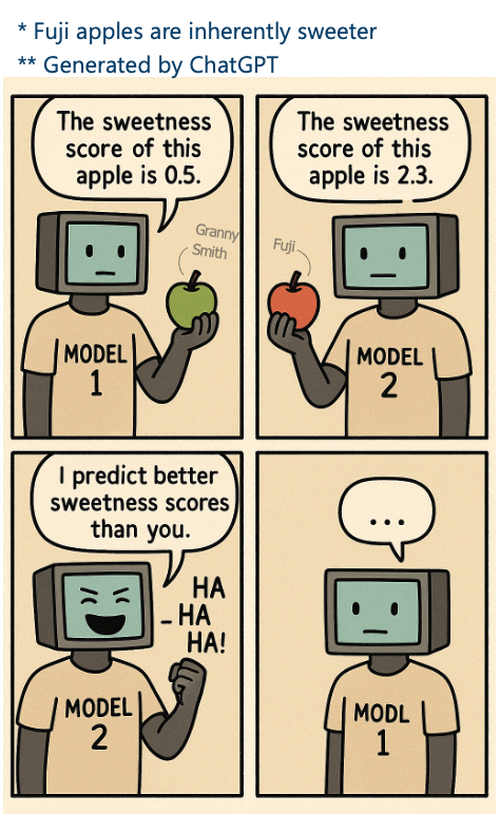
Many compared their results not by re-running other models, but by copying performance numbers from separate publications (Figure 5).
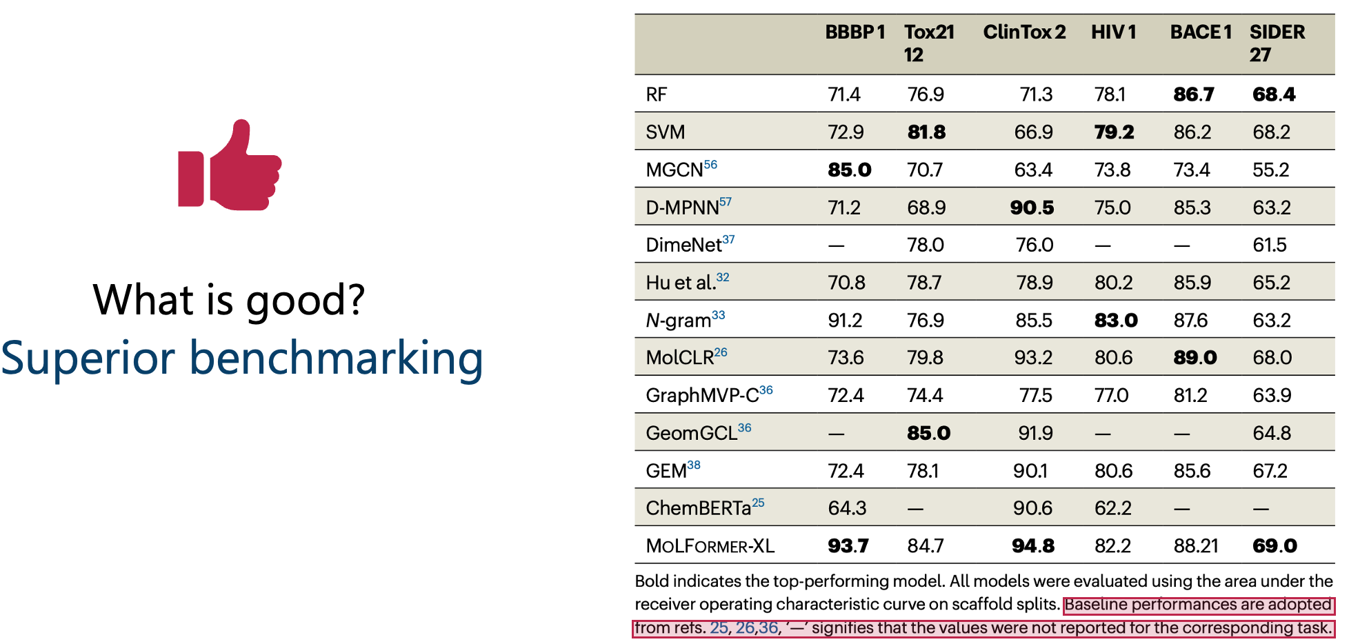
This is unacceptable because, for a fair comparison, both models need to be tested on:
- the same test sets
- the same repetitions (e.g., K-folds)
- the same splitting technique (e.g., scaffold split)
We distilled how each article performed its tests and found: there is no standardized way of testing a model on a dataset (Figure 6).3
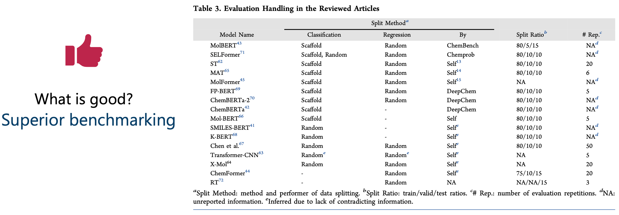
So, comparing one’s number to someone else’s is like this: one person tastes a sour Granny Smith apple, and another tastes a sweet Fuji apple. Then, some observers claim that the person who tasted the Fuji apple is better at detecting sweetness. But they forget to mention that the two people didn’t even taste the same apple!
To draw honest conclusions, we restricted our analysis in the review to the models that were benchmarked under identical conditions.
Again, we plotted the numbers (Figure 7).
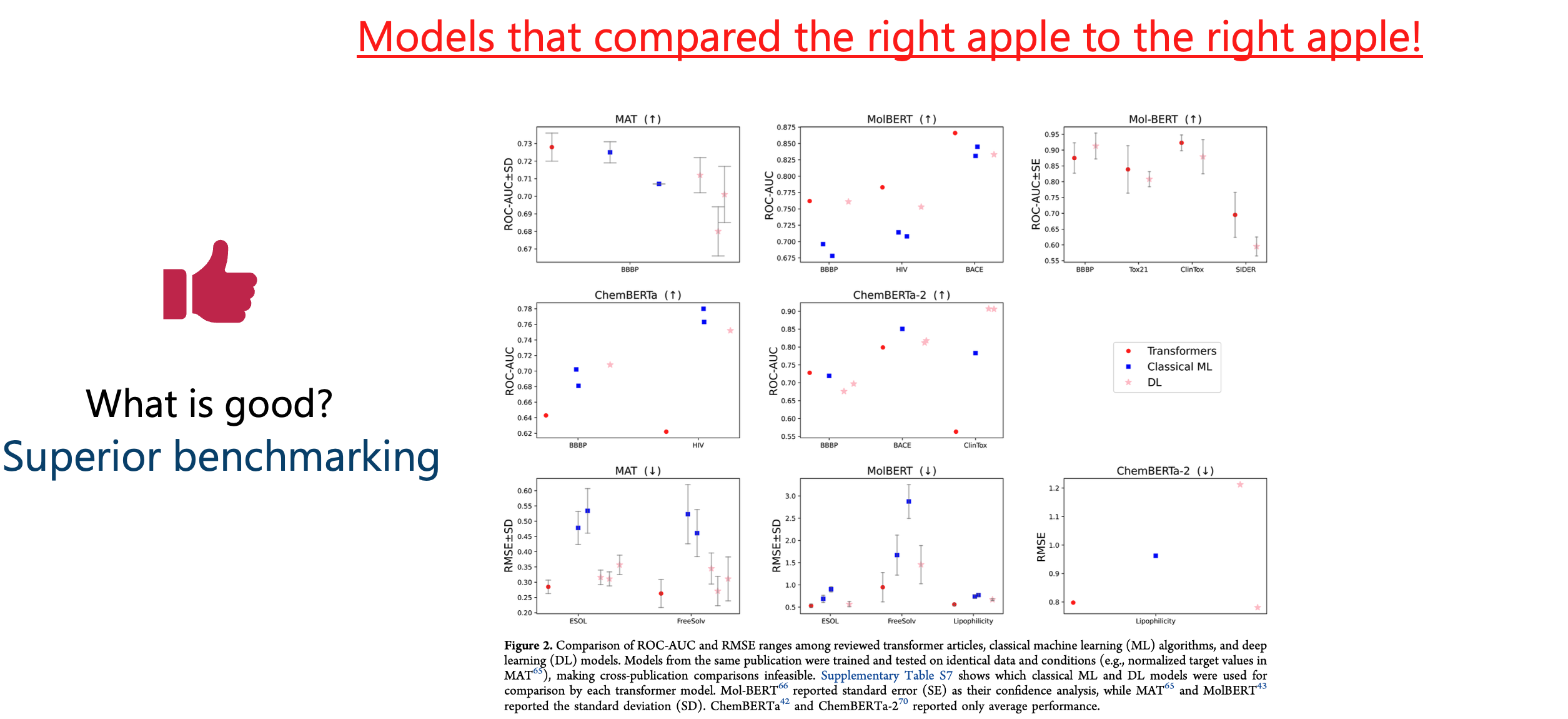
Conclusion (again, oversimplified)?
For each transformer model, there’s a simpler model that performs similarly, better, or the difference is unclear without deeper analysis.
(Detailed walkthrough for the conclusion will follow in the next blog posts.)
Trying to answer “What is good?”, I hoped to find clear trends for building the next great transformer model. Instead, I found that most analyses weren’t sufficient to draw conclusions.
The answer to the next two questions became surprisingly different from expected. Instead of finding the next step for transformers in molecular property prediction, the quest changed to:
- What is missing? → Standards to answer what is good.
- What is promising? → Applying such standards to existing work to decide whether it was justified!
In a later blog post, I’ll walk you through one of these standards in action—repeating an existing study to see if it holds up.
Spoiler alert: it didn’t! 😉
References
[1] Tufte, Edward R., and Peter R. Graves-Morris. The visual display of quantitative information. Vol. 2. No. 9. Cheshire, CT: Graphics press, 1983.
[2] Kahneman, Daniel. Thinking, fast and slow: Ons feilbare denken. Business Contact, 2018.
[3] Gigerenzer, Gerd. Calculated risks: How to know when numbers deceive you. Simon and Schuster, 2015.
[4] Felleman, Daniel J., and David C. Van Essen. “Distributed hierarchical processing in the primate cerebral cortex.” Cerebral cortex (New York, NY: 1991) 1.1 (1991): 1-47.
[5] Cleveland, William S., and Robert McGill. “Graphical perception: Theory, experimentation, and application to the development of graphical methods.” Journal of the American statistical association 79.387 (1984): 531-554.
[6] Eberhard, Karin. “The effects of visualization on judgment and decision-making: a systematic literature review.” Management Review Quarterly 73.1 (2023): 167-214.
This introduces human error. The performance tables weren’t available in Excel, so I had to copy-paste (when feasible) or screenshot them, then use Excel’s image capture and proofreading. It was a lot of manual work—and we all know now that human + lots of numbers is not the ideal mix. I tried my best to ensure accuracy, but no guarantees. ↩
Information was distilled from each manuscript and, when needed, scavenged from GitHub repositories. If something is misreported, it may be due to my mistake (apologies!) or a lack of transparency in the original article. ↩